the power of color
Given the choice, would you rather experience pain in a room painted red, or a room painted blue? If you picked blue you’ve given yourself an advantage. Studies have shown that pain perception is much higher after exposure to the color red and much lower with blue. That’s just one of the surprising ways color affects our brains.
Our mood is the most obviously affected part of us when it comes to color. Instinctively, we know that yellow is associated with uplifting happy feelings, and gray can make us feel low. But the power color has over our brains goes surprisingly deep. Red can stimulate our appetite while blue might make us less hungry. Blues and greens are also associated with better sleep, while bolder colors can keep us more alert and awake.
The effects of color are so profound that it’s being used as a medical intervention in some places. The National Health Service in England has programs to create colored murals and brightly decorated waiting rooms in hospitals. This has caused a noticeable difference in not just patient anxiety, but also health outcomes.
Theories suggest that we are wired to react in certain ways to different colors based on our hunter-gatherer days of seeking out the most nutrient-rich foods which are often extremely colorful. While we don’t fully understand why color has such a profound effect on our biology, we can’t deny that it does.
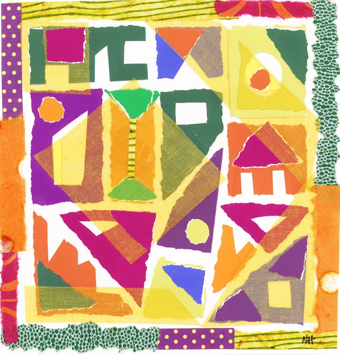
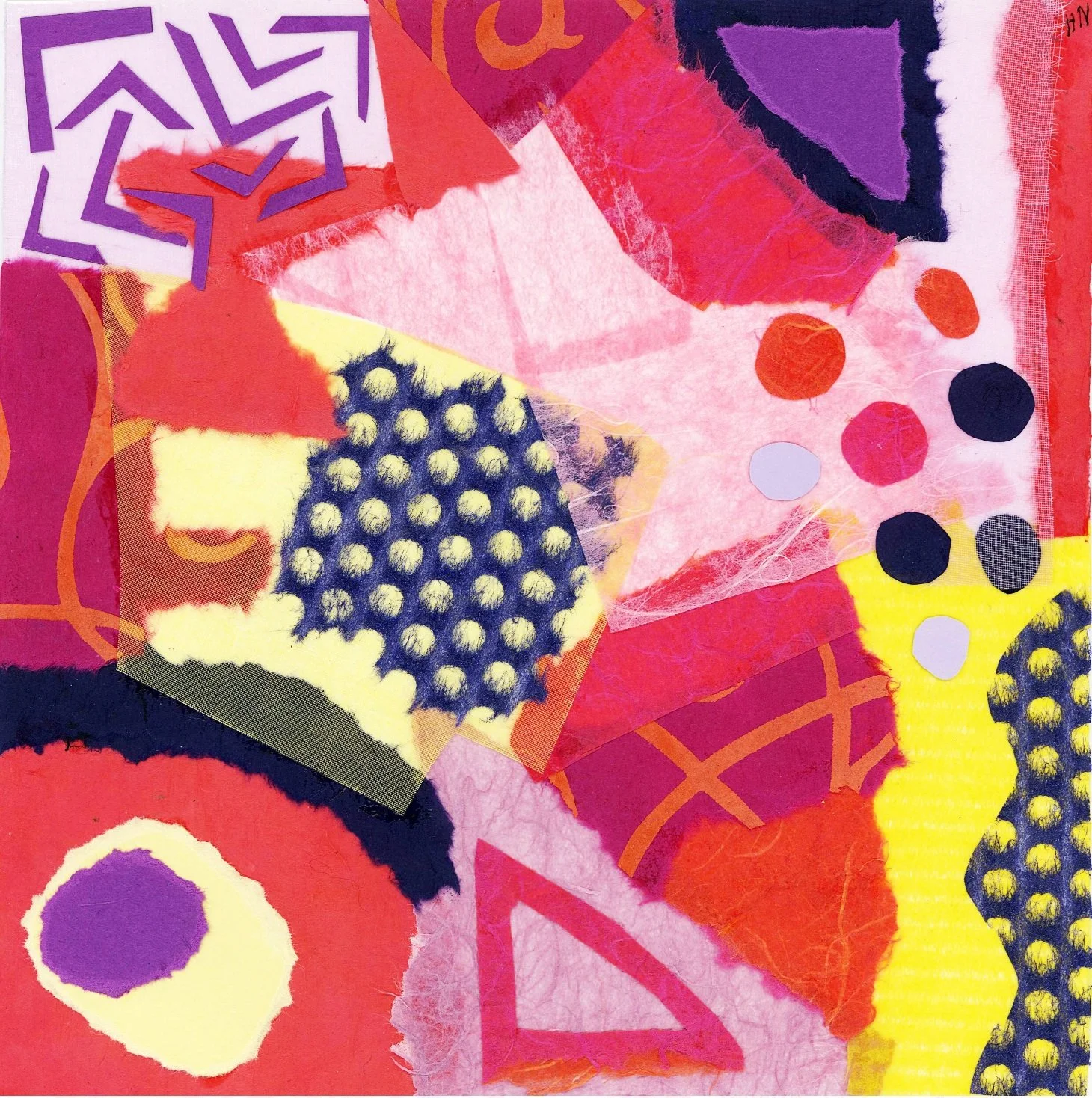
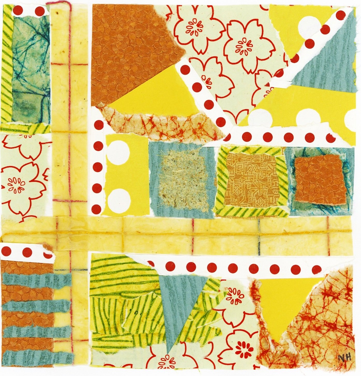
I like to think you can feel the power of the color I use in my art.


Tinkertoys, with its childlike whimsical pattern on a backdrop of joyful, vibrant, yellow evokes a frivolous, fun, feeling.
In contrast, the cheerful yellow in my piece, bold, sits among jagged black edges unleashing a feeling of power and focus. The overall experience of this piece would be dramatically changed, if blue was used in place of the yellow-don’t you think?
With patterns and colors in place of more obvious depictions of human life, my art becomes more of an experience than a story. The palette truly colors that experience.
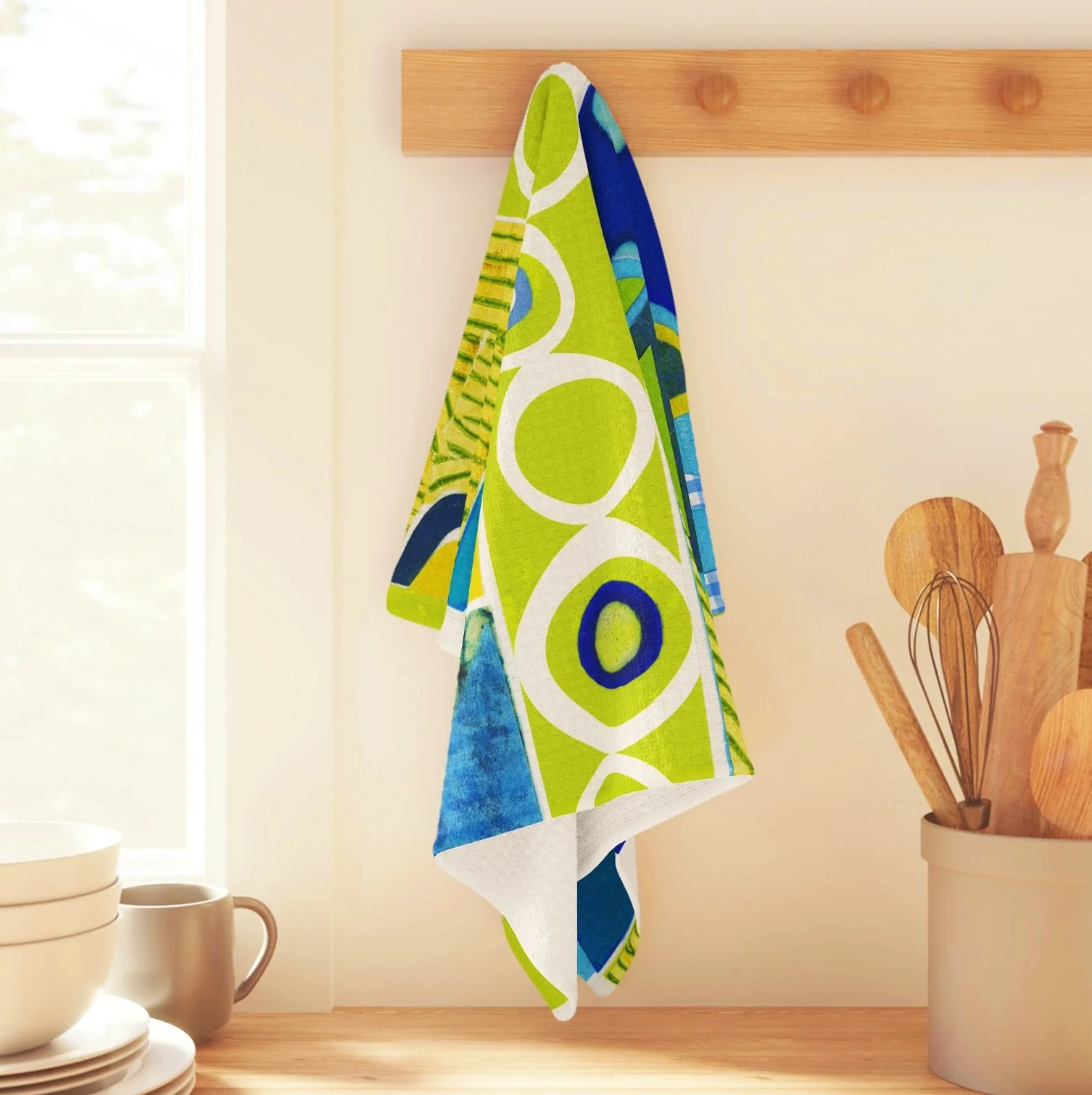
Now that my store is open it’s interesting to browse the different products and see how a colorful pattern changes an object. Each phone case design, for example, brings a different mood to the same object. How funny a feeling it is to have a tea towel change the mood of a kitchen.


It never ceases to amaze me how colors, shapes, and patterns arranged can express so much. It gives a voice to the world around us, communicating a subtle message and we speak back through our emotions.
What message do you want the world around you to communicate? Let me know in the comments.